Color Contrast Darkmode Brand Standards Accessibility
Color contrast 101
Role 〰️ Creative Director
Client 〰️ YouTube
Region 〰️ Global
Audit of core YouTube brand for accessibility issues particularly for use in email communication
Goal 〰️ Identify and create solutions for a variety of accessibility challenges within the YouTube brand specific to its variety of digital marketing channels in a way that educated my clients and my own design team how to design with accessibility for all surfaces.
✦ Full audit of color contrast with recommendations on colors that should never be used for legibility considerations
✦ Created guidance on priority marketing surfaces that needed ALT text and live text improvements


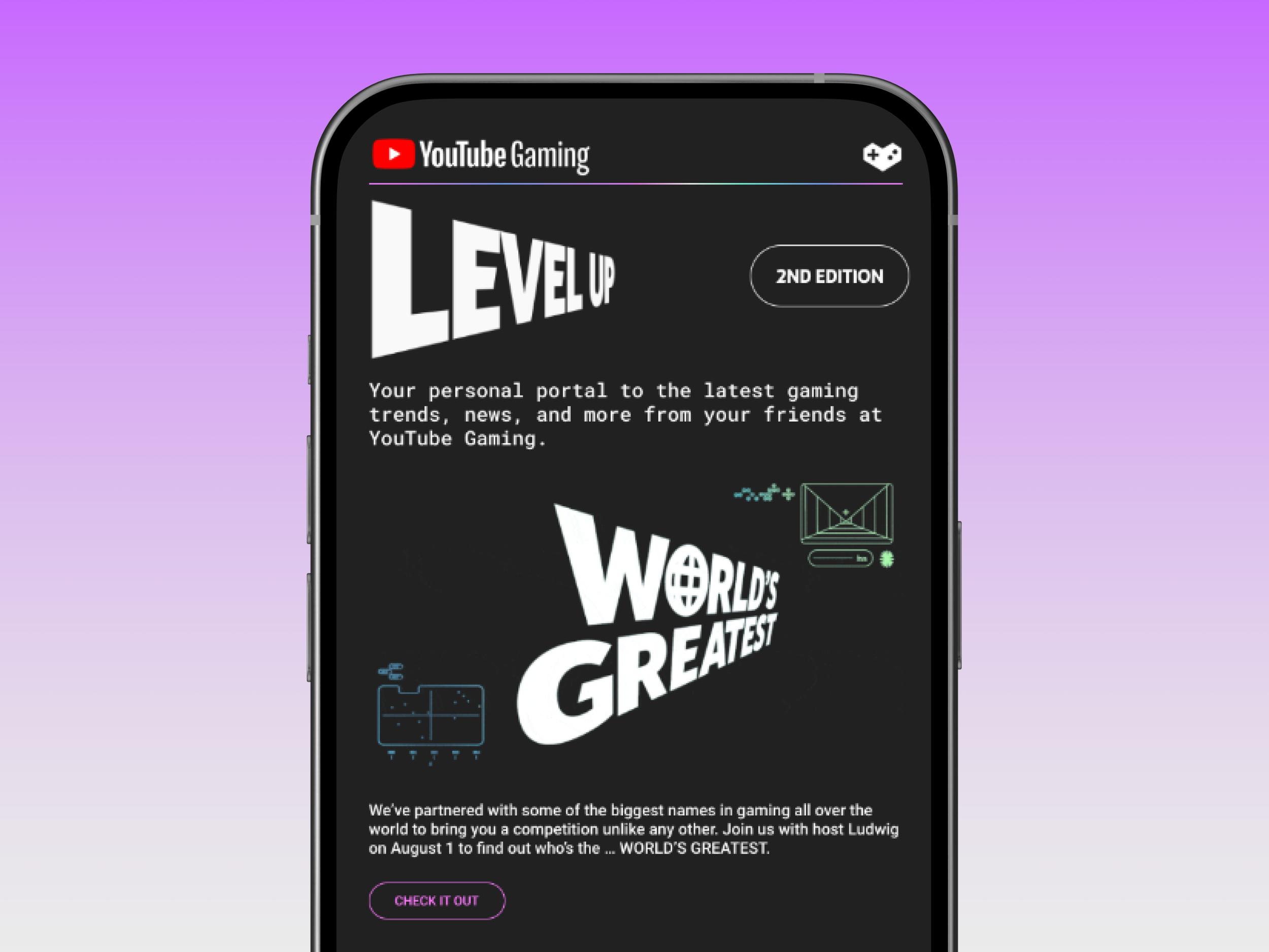
Darkmode alters brand colors differently on each device, so I had my team test color contrast for the full set of brand colors to ensure it was accessible to all customers and all devices using white or black text on the colored background. Our standard required that it must pass AA standard for display text usage, and AAA for body copy.
Solution 〰️ Create variety of sessions with my design team and clients to educate on how to improve accessibility. Then followups of color contrast and marketing services audits that were crowdsourced by my design team (allowing me to teach them the tools to check for accessibility) and then repackaged with strong recommendations on improvements.